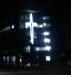
Dear Mercy: Please turn down the lights

The new Mercy West Lakes Hospital in West Des Moines is quickly approaching completion, but someone really needs to explain why they chose to add a gigantic four-story, brightly-lit cross to the side of the building. Yes, the cross is stylized in the Mercy fashion, but for heaven's sake (pun intended), why did they make the thing so large? Count the number of levels for yourself: It covers four complete levels of the building, and faces out into traffic along 60th Street and Westown Parkway. At such a height, it dwarfs everything around, except for the hospital itself. The Hy-Vee corporate offices across the street are only two stories tall. The cross is just too large, and it's undoubtedly going to create traffic accidents. Mercy is an excellent medical center in its own right; this kind of advertising (if that's what it's supposed to be) doesn't befit the standards of the organization itself.
0 TrackBacks
Listed below are links to blogs that reference this entry: Dear Mercy: Please turn down the lights.
TrackBack URL for this entry: http://desmoinesist.com/cgi-sys/cgiwrap/gongol/managed-mt/mt-tb.cgi/34

Leave a comment